Rang De | Social Investment
India’s first social investment platform providing P2P lending to rural entrepreneurs

Role
Product Design
Design Strategist
Brand Designer
Timeline
1 year
Sep’21 - Aug’22
Tools
Figma
Adobe Illustrator
Miro
Team
Product Managers (2)
Software Dev (6)
Design (3)
Background
Rang De is India’s first peer-to-peer social investment platform, that aims to provide loans to the millions of Indians who either cannot afford or are denied credit by the banks. By tapping into the power of many, and decentralizing the source of funds, the mission is to significantly reduce interest rates on loans.
I joined Rang De as UX Designer to give enhance the app and web platforms and soon took a lead role in shaping the future of this product on the digital front.
I joined Rang De as UX Designer to give enhance the app and web platforms and soon took a lead role in shaping the future of this product on the digital front.
More about my role
When I became a part of Rang De, the product, especially the app was undergoing major upscaling, redesign, and rebranding. The job was as demanding as it was thrilling and fulfilling.
I underwent serious professional growth and expanded my skillset to share tasks of the Product Manager and Graphic Designer as well. I worked alongside several software developers, two Product Managers, a UI Designer, and the Growth and Engagement team.
During my time at Rang De till now, I have successfully implemented several important projects and tasks such as -
01 | ACHIEVEMENT
Set up a proper design pipeline and process
Before this, the company had to resort to external design agencies for web and app designs. I was able to establish a solid structure and transparency among everyone involved in the product. This helped create a sense of direction and a better understanding between SDEs, PMs, and Designers.
02 | ACHIEVEMENT
Establishing a
design system
design system
This primarily helped improve the product’s visual and interactive consistency across the website and the app, while also reducing the time spent on design and development at later stages.
03 | ACHIEVEMENT
Revamping both app and web products
My arrival marked considerable changes in the product’s interface, experience and usability, and consistency. In some cases, pages and features underwent a complete overhaul in several installments.
The design process
At Rang De, I introduced the concept of a Modified Design Sprint for addressing existing issues and for the addition of innovative new experiences and interactions to enhance user experience. The Design Sprints last for 1-2 weeks, which is longer than the typical 5-day sprint in order to put additional efforts into user research and testing prototypes. I conducted the Sprints along with the product managers. The steps involved in the process are -
01 | ALIGN
I led discussions of our issues, pain points, and reviews from our users that have been gathered since the release of the previous features. We then converged on one or more Sprint Questions that represent the problems that we tried to solve.
02 | IDEATE
I guided the team to gather inspirations from other products and research how others solved similar problems and filtered the most interesting ideas and merged them with our needs and our own ideas. Following this, we put our thoughts on paper to create sketches of user flows.
03 | DECIDE
All the solution sketches were put up anonymously on the board. I led critique sessions for the whole team to review each concept. The best solutions were converged upon using dot-voting. Then together, we created user-journey maps and relevant frameworks.
04 | MAKE
I then converted user journey maps rapidly into prototypes on Figma. This step is almost completely done by me from designing individual elements and then stitching the steps together.
05 | TEST
Finally, the PM and I together finalize the ultimate user flow and develop an interview script. User-testing is then conducted with 10-15 users that are picked from our pool of real users. Insights from testing sessions are then processed to iteratively ideate to refine solutions.


Understanding the Problems
User Pain Points from Primary Research
Through personal interviews, surveys, and user feedback data, we aimed to identify the major issues that users were facing with the product. We divided our users into 2 groups - New Users; those who had either not heard about Rang De or had not completed the signup process, and Existing Users; who had essentially been extremely loyal members that wanted to create social change despite having a bad user experience.
01 | NEW USERS
Had issues understanding the company’s goal and business model
Were under confident to invest a considerable amount of money in a new concept as they lacked trust in the platform
Lacked motivation to create social change
Were confused by differences in the web and the app user interface and experience
Often misunderstood social investments as donations
Lost patience trying to complete the lengthy onboarding and signup process
02 | OLD USERS
Upset by the lack of tracking capabilities of their funds
Could not find an efficient means to share the cause and onboard friends and family to the app/website
Were confused by differences in the web and the app user interface and experience
Had issues with the search page interactions for investment opportunities
Differences between the web and app products regarding investment data
Non-functional features and pages across the platform
Persona Study and Journey Mapping
Upon synthesizing our findings and consolidating upon user needs and frustrations, we generated the persona that represented our target user. Based on the persona, we defined an end-to-end journey map for our typical target users from product discovery to becoming active investors on the platform. At each point of the journey map, we narrowed down critical pain points and opportunities for improvement.


Defining the Problems
01 | HMW
Before I joined the company, the designs for both the app and the website were created by separate external design agencies. This led to completely different experiences for the web and the app product. The lack of consistency across the platforms had a negative effect on the brand image and also caused significant development and implementation problems.
How might we...create a consistent brand identity for all Rang De products?
01 | HMW
Since Rang De is essentially an investment platform, it has to abide by the Government’s financial regulations. Know Your Customer(KYC) Verification is, therefore, a mandatory process. However, testing proved that the cumbersome and time taking verification caused a high dropout rate. Further, the signup process required a lot of information from users that they had to enter manually.
How might we...reduce users’ hestitation to sign up on Rang De?
01 | HMW
As social investment was a new and upcoming term in India at the time, very few users trusted our vision. Our reputation only spread through word of mouth of loyal users. The was a significant lack of communication of goals, benefits, and features through the product. Further, a lot of pages/features were not intuitive for the users which made the user feel under confident.
How might we...build trust among users and increase user-retention?
Creating a design system from scratch
It is important to maintain consistency among various platforms and products during scaling. As Rang De was in a state of rapid transformation, a design system was urgently required so that the Design and the Software teams could be on the same page and work more efficiently. Creating a whole new design language, brand image, and style guide was one of the most challenging tasks during my time at Rang De.I worked collaboratively with our UI Designer and Brand Manager to create the style guide while the Front-end Developers created the code snippets for interactive UI elements.

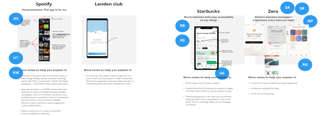
Storytelling through Illustrations: Developing a new Visual Art Style
Communicating Rang De’s model was a challenge for the company since the beginning. My hybridity as an Illustrator was an exceptional asset in this case. I used a simple, elegant, and fun art style to tell the story of the company on the landing page. These visuals helped users understand the business model and gain trust.
Ideation and Sketches

New Welcome Experience
Fun, Engaging, Trust-building Onboarding
From analyzing user interviews, it was inferred that users are more likely to support and invest in social causes if they see social-proof of a community of fellow investors who have invested in similar causes. Users also felt more comfortable with a company that had more reputation and security parameters thats they could trust. A change in the onboarding approach which boasted of our security, accomplishments, and rich social investment community helped increase user sign ups.

Expediting KYC Verification Flow
A simple and more intuitive Know Your Customer(KYC) flow was designed to make onboarding process fast. Upon testing, it proved to increase sign-up process completion by almost 25%.

Investment Flow Redesign
Investee Cards and the Invest Page
One of the major challenges for the platform was to be able to display the information about the individual investees in a concise yet informative manner while providing a quick method to invest.
A simple card-based display system worked best for the users as it resembled the typical items display for an online shopping website.

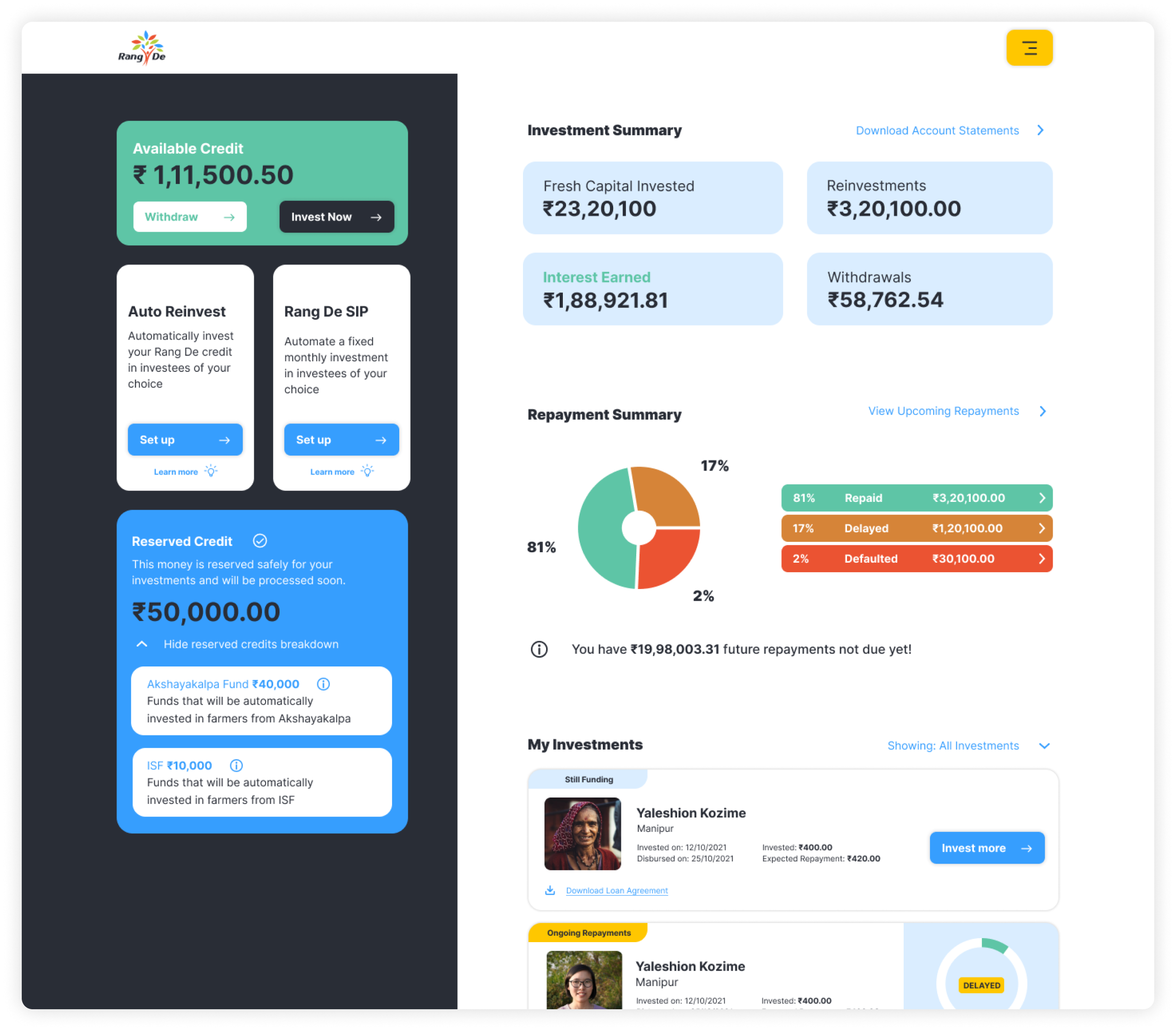
Investor’s Dashboard
The Rang De Dashboard is the environment where a user can track the progress of his/her investments and credits while also being able the measure the magnitude of the impact that he/she has created towards a more developed India. This increased the trust and confidence for the user by guaranteeing as sense of safety for their funds.
Results and Impact
Increased user signups by 25% per month. Further, 60% of users turned into active users that invested at least once per month.
Development of the fund feature increased the total amount investments by more than ₹100 milion (1.2 million dollars) that funded thousands of rural entrepreneurs across India.
Saw a significant improvement in user satisfaction and feedback post complete app and web revamp.
Learnings and Takeaways
Being the sole UX Designer and Design Strategist can be extremely challenging and comes with its own set of learning experiences. It was the first time that my decisions were shaping the future of the product.
One of the most important things that I have learned during my time here is that it’s impossible to create a product that appeals to every audience equally.
Several targeted users may not like or understand your product. At such a time it is important to create that one persona to whom the product will definitely appeal and then shape it around them, gradually expanding it to the needs of the others.
Further, I gained a lot of skills as a strategist and facilitator. I learned how to create and implement design systems and conduct design sprints for the organization,
